
Art Deco City: New York, Postcards from the Leonard A. Lauder Collection
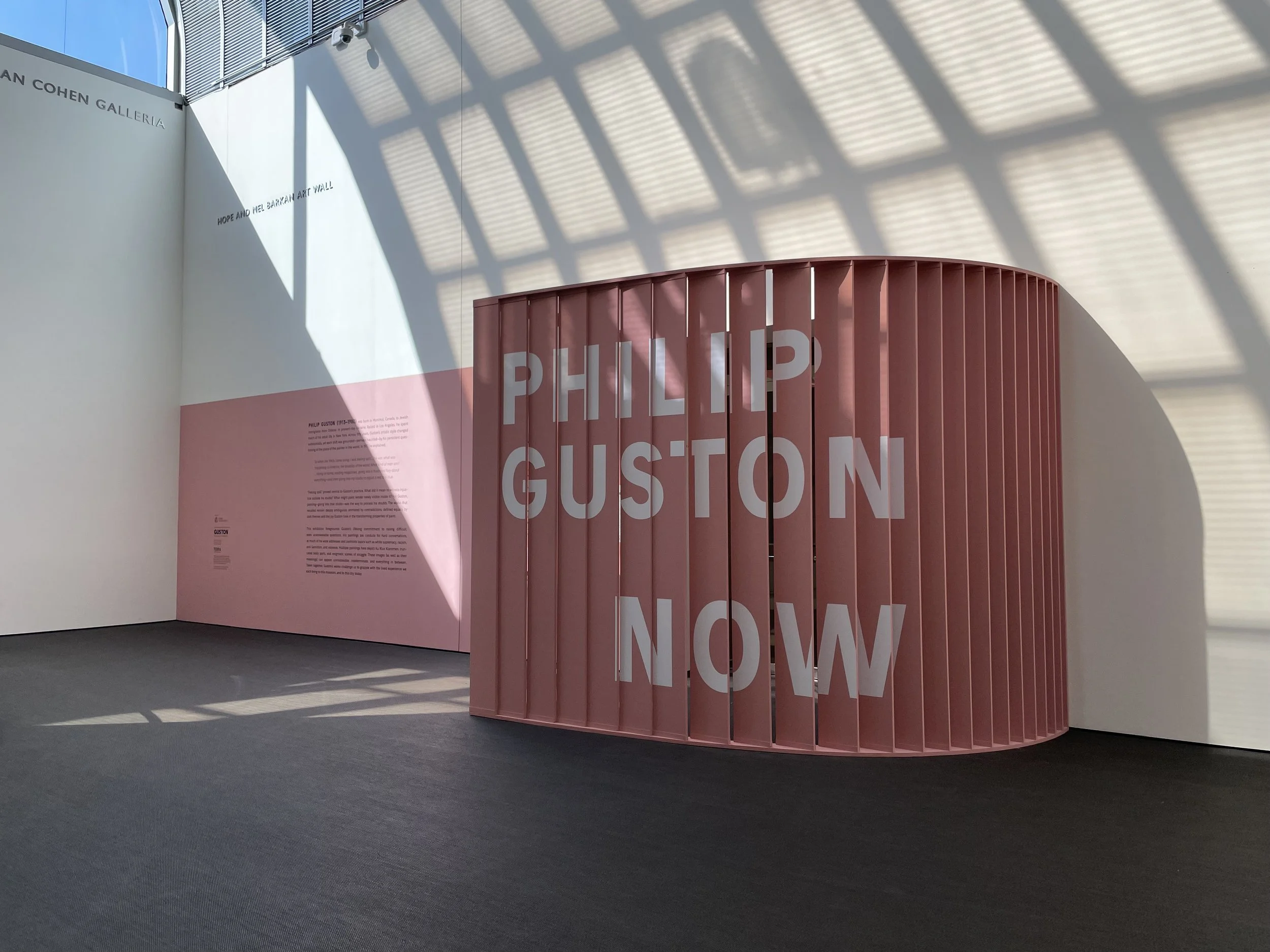
Philip Guston: Now
Stories Artists Tell: Art of the Americas, the 20th century

The Art of Influence: Propaganda Postcards from the Era of World Wars

Crafted: Objects in Flux

Fabric of a Nation: American Quilt Stories
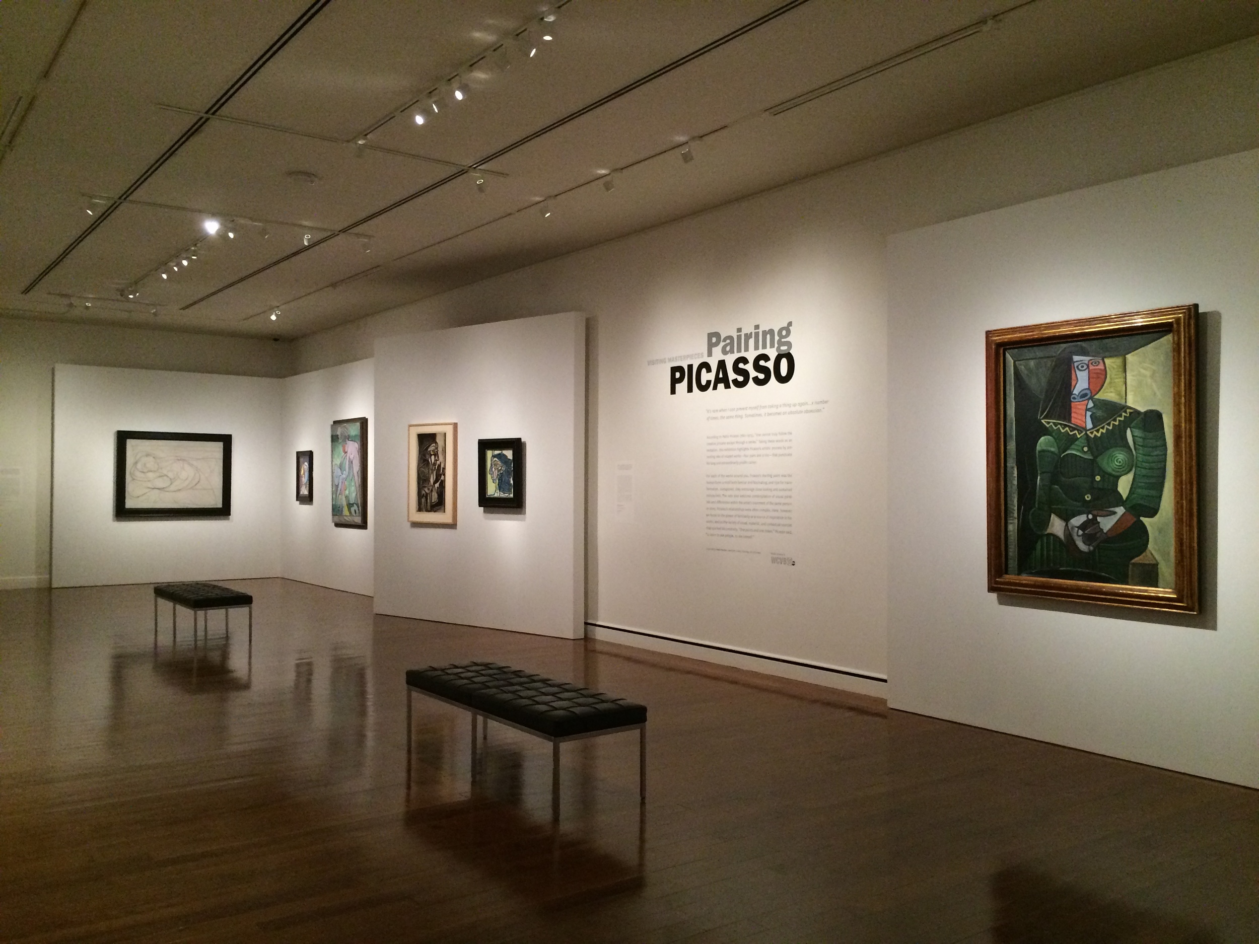
Visiting Masterpieces: Pairing Picasso

Frida Kahlo and Arte Popular

Klimt and Schiele: Drawn

Winnie-the-Pooh: Exploring a Classic
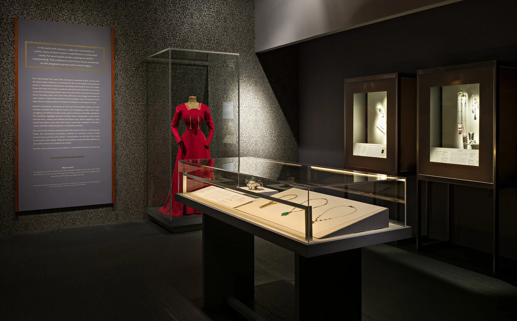
Boston Made: Arts and Crafts Jewelry and Metalwork

della Robbia: Sculpting with Color in Renaissance Florence

Toulouse–Lautrec and the Stars of Paris
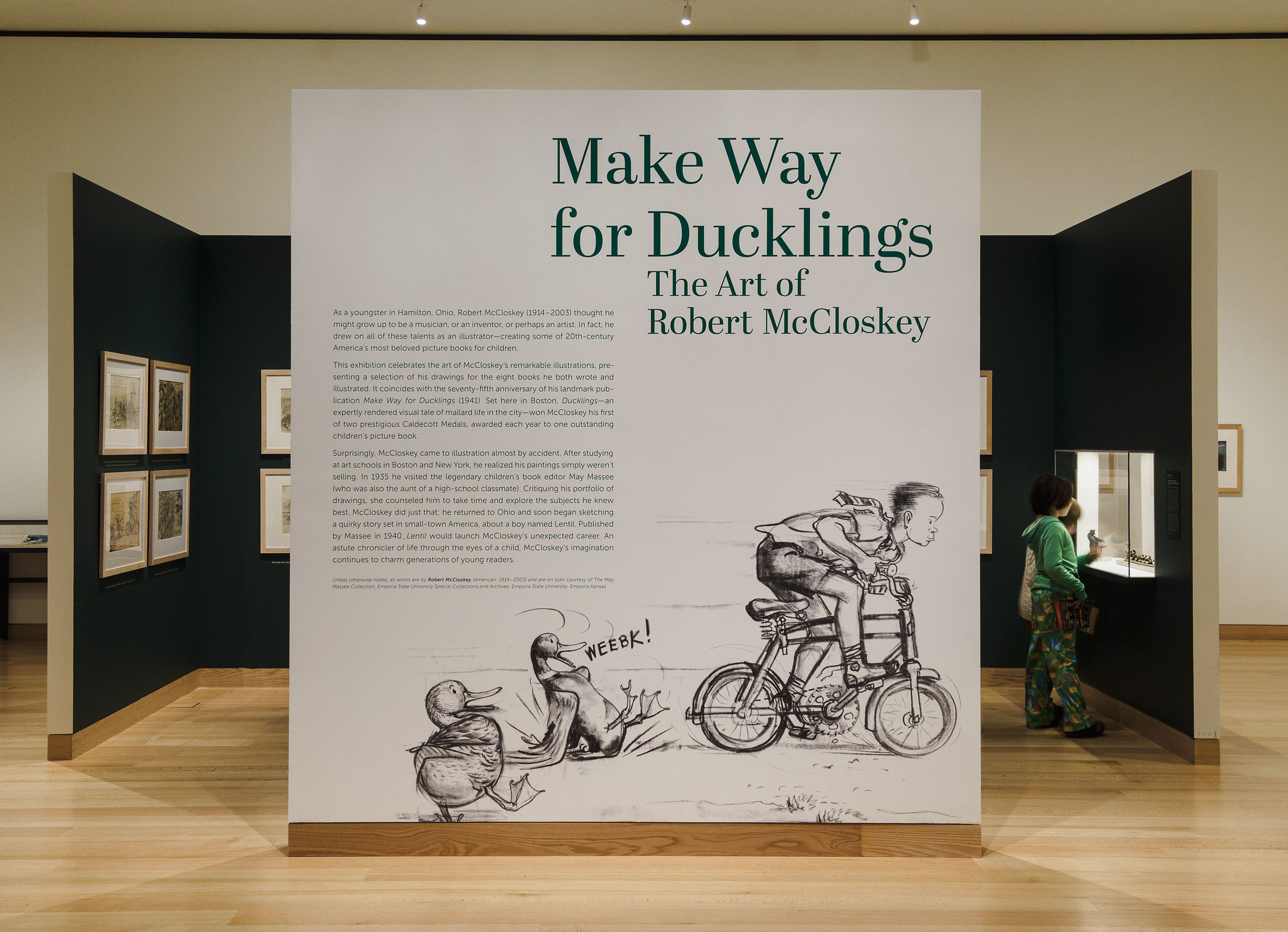
Make Way for Ducklings
ADDITIONAL WORK
Images and more info available upon request.
-
This exhibition spanned the entire Museum of Fine Arts, Boston’s collection and was organized into 21 pairings, each putting into conversation a recently acquired contemporary work of art with a rarely seen object acquired earlier in the Museum’s history.
As an organizational design element, I used semi-circular platforms and stanchions to showcase each pair and create a unifying visual thread through the gallery for what would be inevitably an eclectic group of objects. I was also part of the team reviewing submissions to the museum-wide call for suggested pairings.
Team: Michelle Millar Fisher, Debra Lennard, Marina Tyquiengco, Eben Haines, Cyrille Conan, and me.
-
This exhibition told the history and evolution of the term, Folk Art, and took on the question of why we differentiate fold art from fine art.
In a small gallery space, and an object list combining many 2D and 3D work, I designed a central core with case cut outs to house objects and also allow views across the room. This helped organize the visitor experience and leave room on the perimeter walls for paintings and works on paper.
Team: Nonie Gadsden, Eben Haines, Cyrille Conan and me.
-
My team worked closely with Samantha to create a completely immersive room centered on her video piece. This included walls covered in magenta tinsel, floors of shag carpet and black and white checkered floor vinyl, neon signage and surround sound music, and an (empty) heart shaped hot tub.
Team: Michelle Millar Fisher, Tatiana Klusak, George Scharoun, Cyrille Conan and me.
-
This was a show few got to see as it opened March 1, 2020. The exhibition looked at Freud’s artistic development through his self-portraits, a subject he returned to repeatedly throughout his career.
The work was laid out in a chronological loop, with an interactive room midway that recreated Freud’s studio. This space included drawing materials, mirrors, stools and a reading area.
Team: Akili Tommasino, Eben Haines, Cyrille Conan, and me.
-
This exhibition included 70 paintings and drawings charting Bloom’s career as well as his interest in the human body.
Team: Erica Hirshler, Martina Tanga, Tatiana Klusak and me.
-
This exhibition celebrated photography both as an art form and as a cultural and political force. The Greenberg Collection brought together some of the most enduring and powerful photographs of the 20th century.
Team: Kristen Gresh, Eben Haines and myself.
-
This exhibition looked at the similarities and differences between the two artists’ work, who shared a mutual respect and a mentor-student relationship. The show included 60 drawings organized thematically.
To emphasize the intention to ask the visitor to look and compare first, we installed all of the labels on angled ledges, beneath the work, keeping them off the walls and as secondary step of interpretation.
Team: Katie Hanson, Jennifer Liston Munson and me.
-
For this exhibition, we simulated the experience of an early 19th century Phantasmagoria show. The visitor walked down a dark lanterned hallway to view a rear-projection video produced using original hand-colored lantern slides. After the Phantasmagoria show, the exhibition included other optical toys and devices as well as drawings to illustrate the cultural moment.
Team: Ben Weiss, Nick Pioggia and me.
-
This exhibition focused on the visual legacy of Ansel Adams, presenting some of his most celebrated work along side contemporary artists whose work directly points to his legacy.
Team: Karen Haas, Eben Haines and me.
-
This exhibition celebrated graphic design and photography with 120 posters, album covers and photographs from the late 60s.
Team: Patrick Murphy, Eben Haines, and me.
-
This exhibition explored the changes in Botticelli’s style and subject matter, from poetic to austere, reflective of the shifting political and religious climate of Florence during his lifetime.
Team: Frederick Ilchman, Jennifer Liston Munson and me.
-
This exhibition brought together the work of 11 contemporary artists, living in megacities in Asia, responding to the political, environmental and social conditions of their home cities.
The exhibition extended beyond the core gallery space to galleries through the museum, the front lawn and public gathering spaces in the city.
Team: Laura Weinstein, Al Miner, Keith Crippen, Nick Pioggia and me.
-
This exhibition explored the photographic response to the earthquake, tsunami and Fukushima disaster in Japan in March of 2011. The show included the work of 17 artists and considered how art provides both a language for reflection on tragic events and contributes to human recovery.
Team: Anne Nishimura Morse, Anne Havinga, Jennifer Liston Munson and me.